Interaction Design
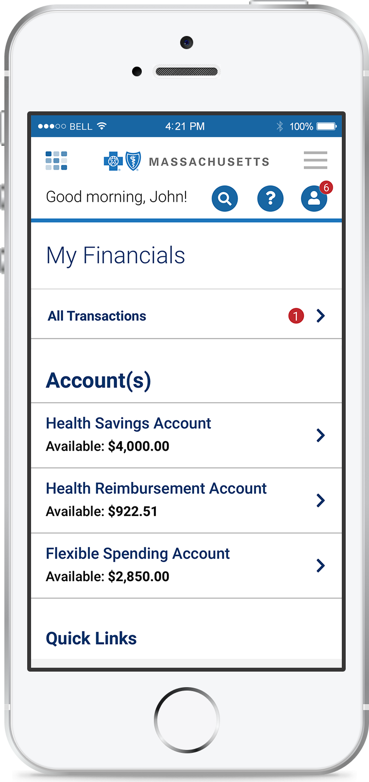
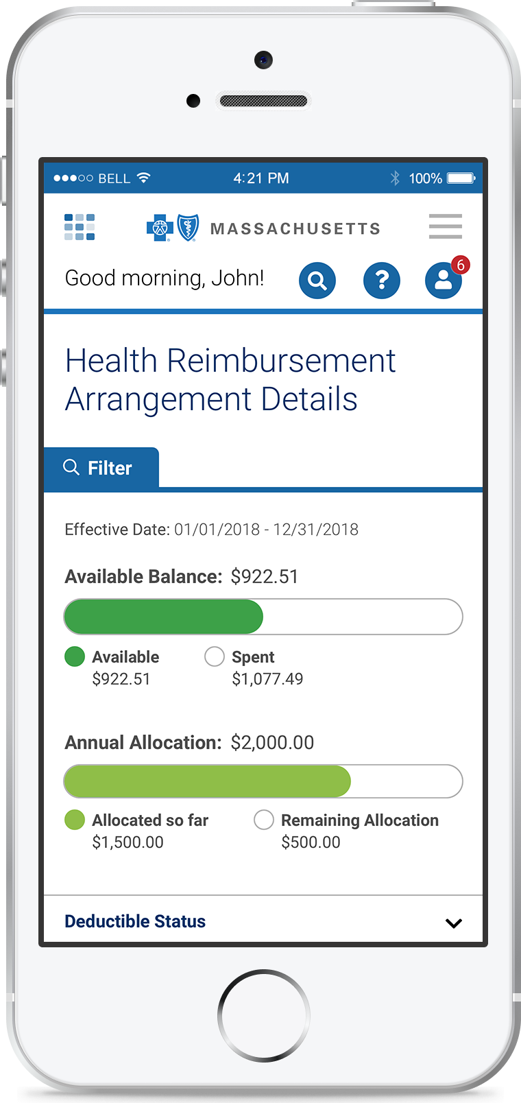
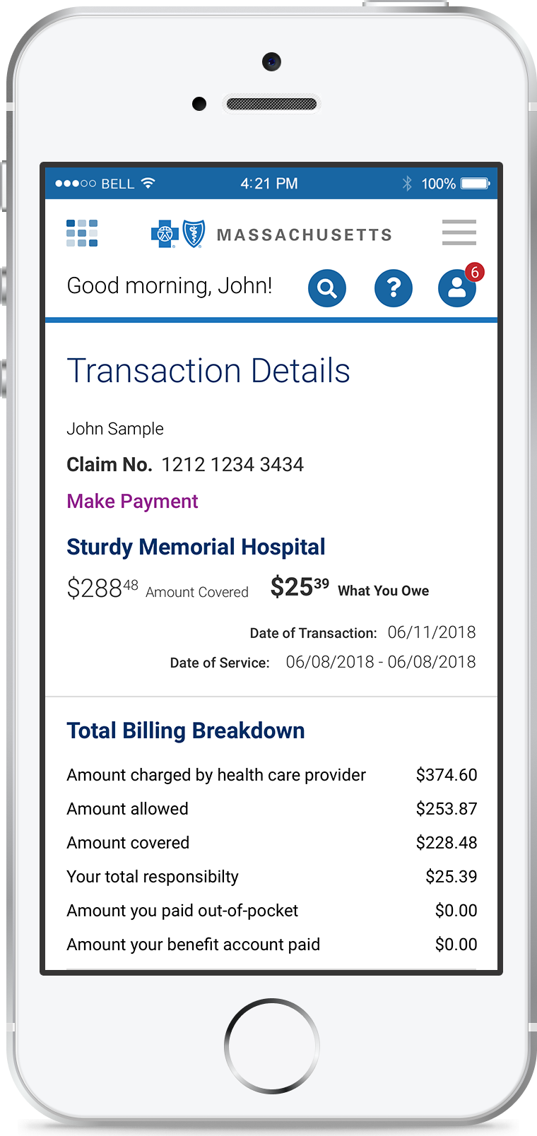
I need to emphasize that this project was BIG. I was one of three design leads and responsible for the My Financials feature. The API-based solution from the vendor Alegeus provided the means to deploy a seamless user experience at Blue Cross MA.
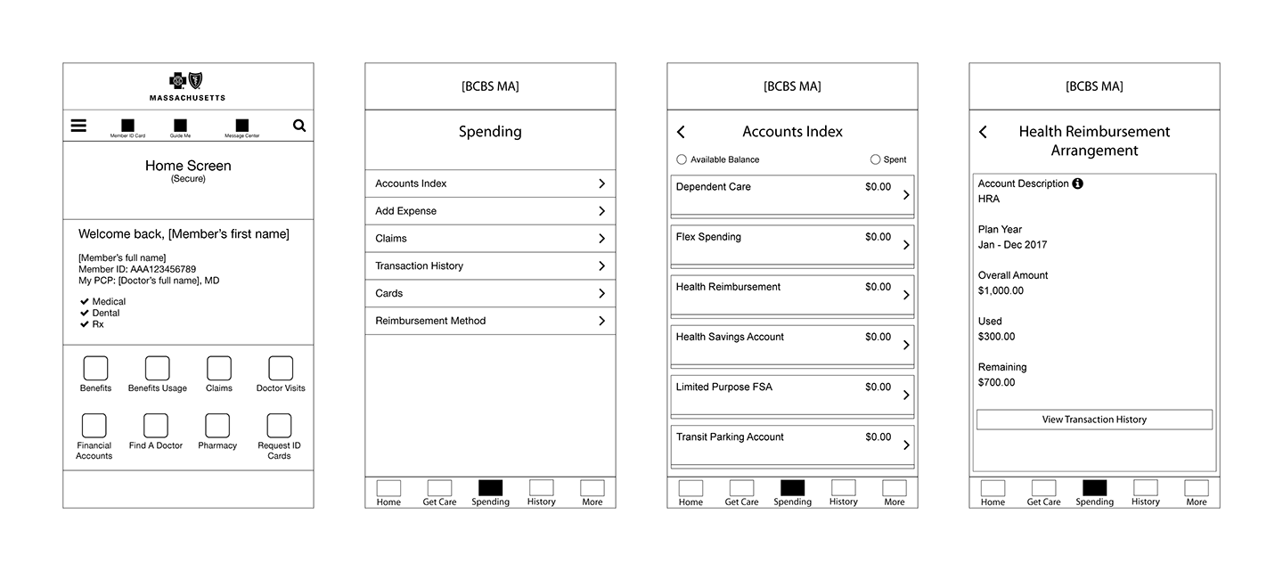
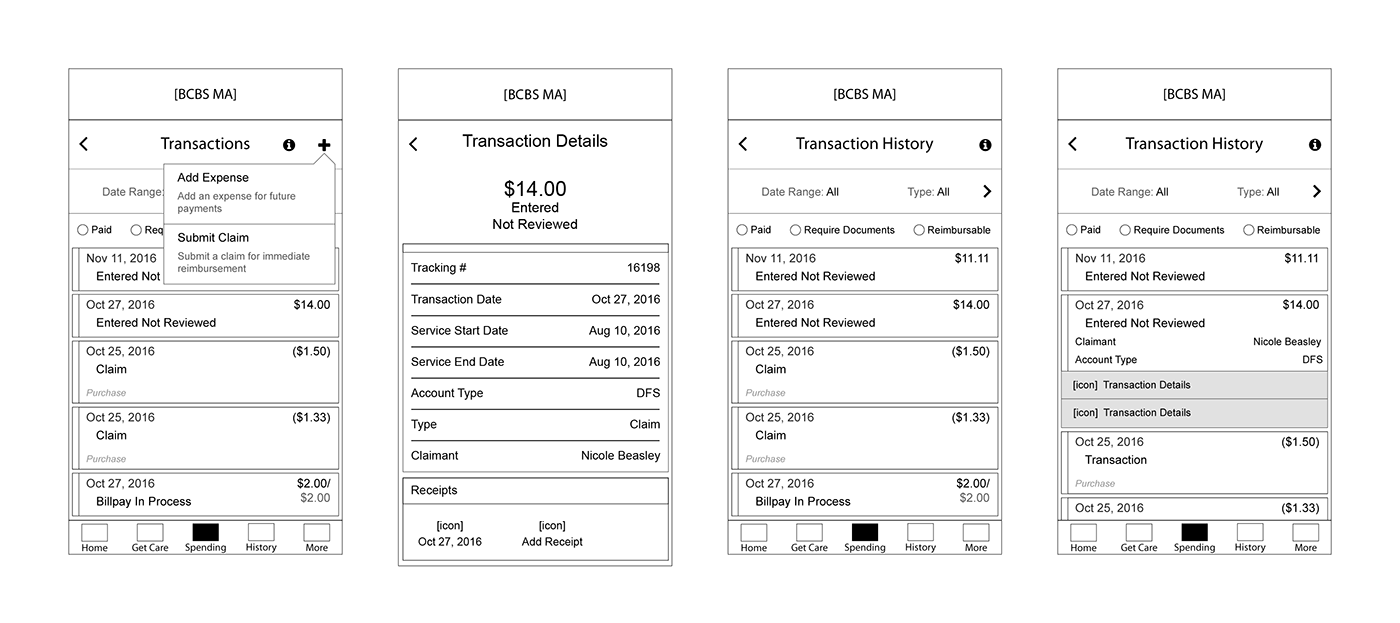
There were several interations of wireframes that spanned both the web and app projects. I used these early wireframe screens for Invision-based mobile prototypes to demonstrate the experience.
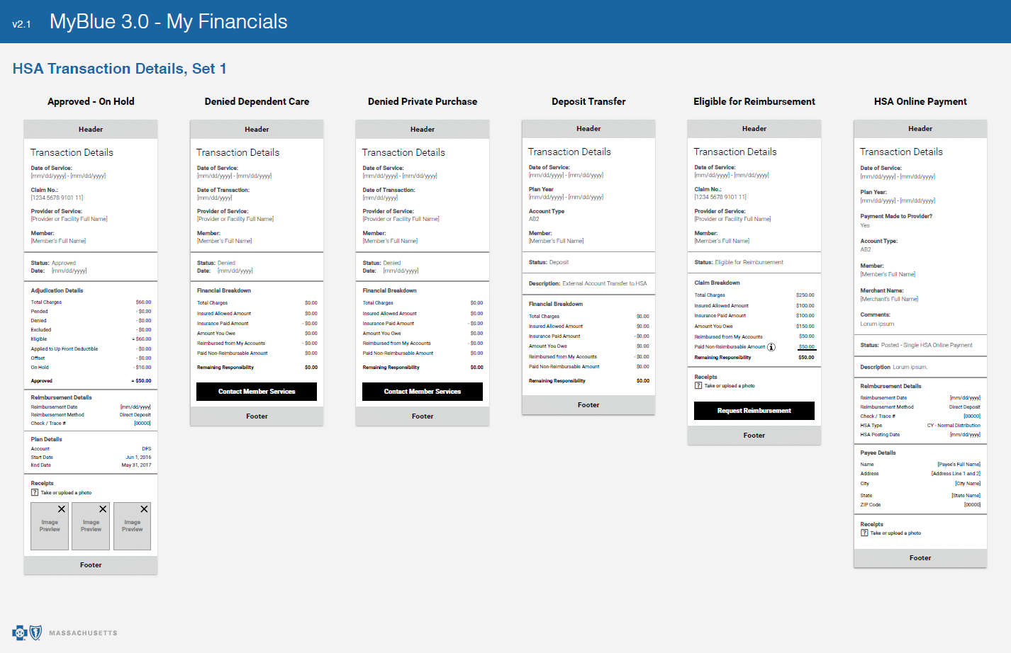
Early Wireframe Screens

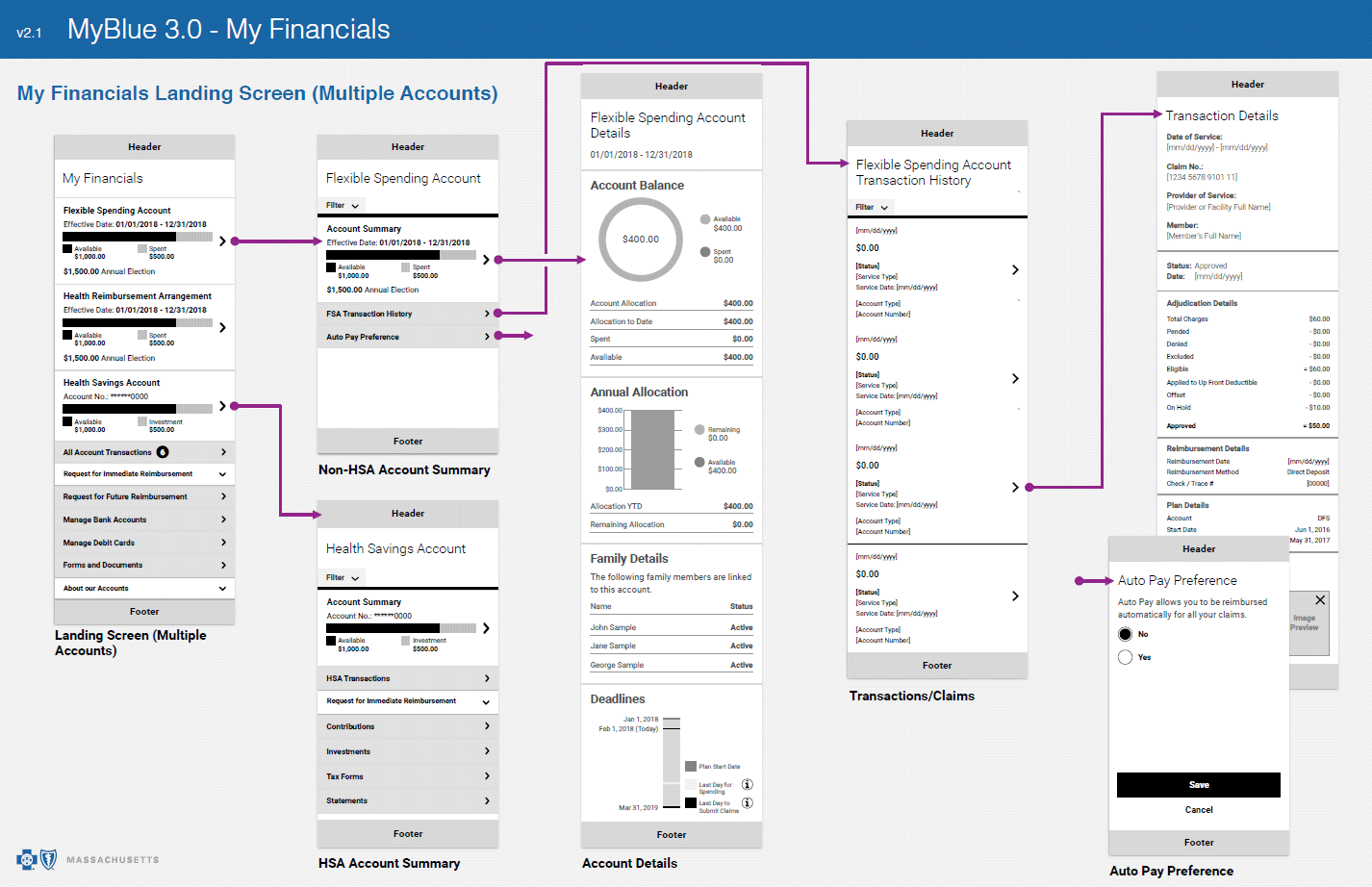
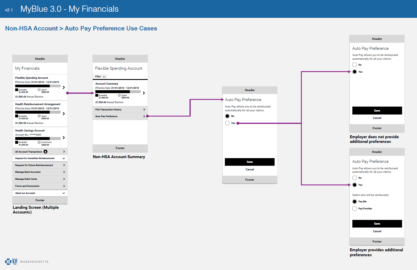
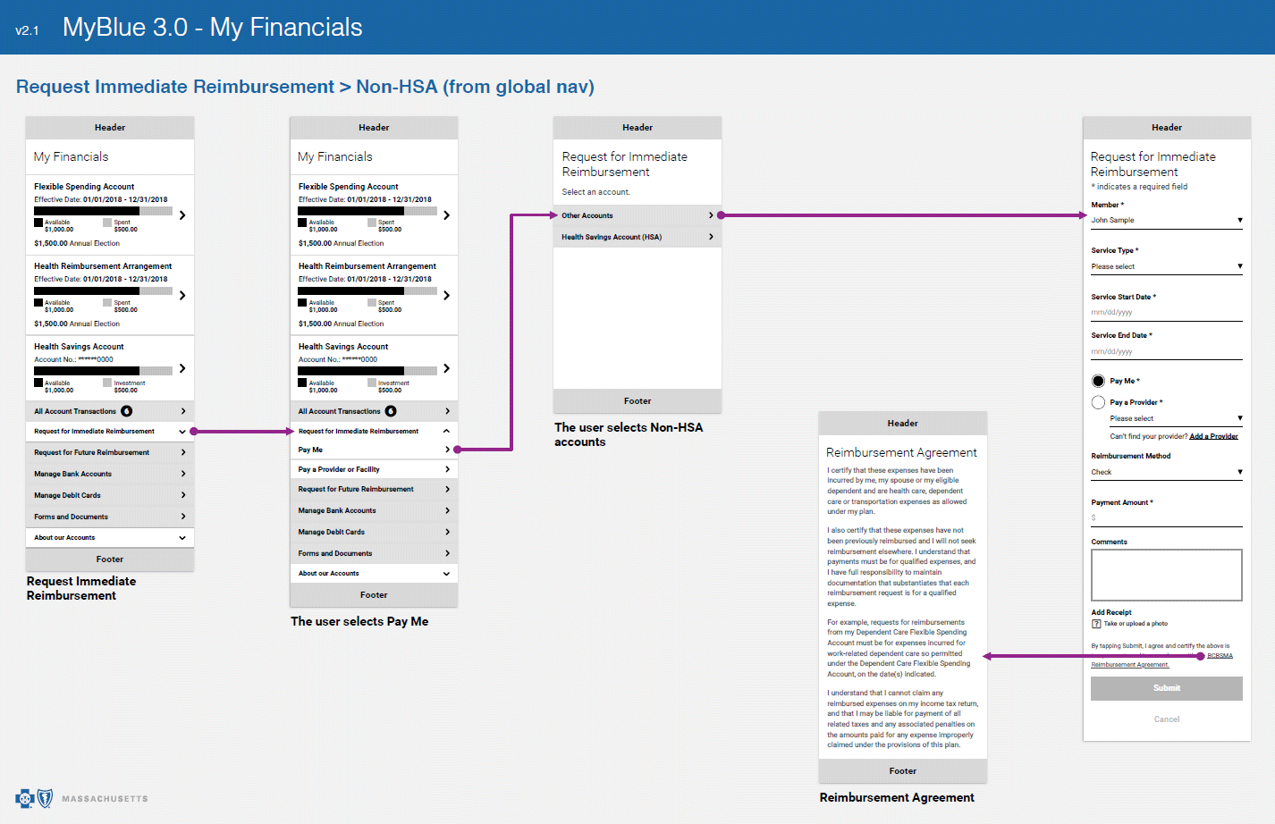
Wireflows


Visual Design
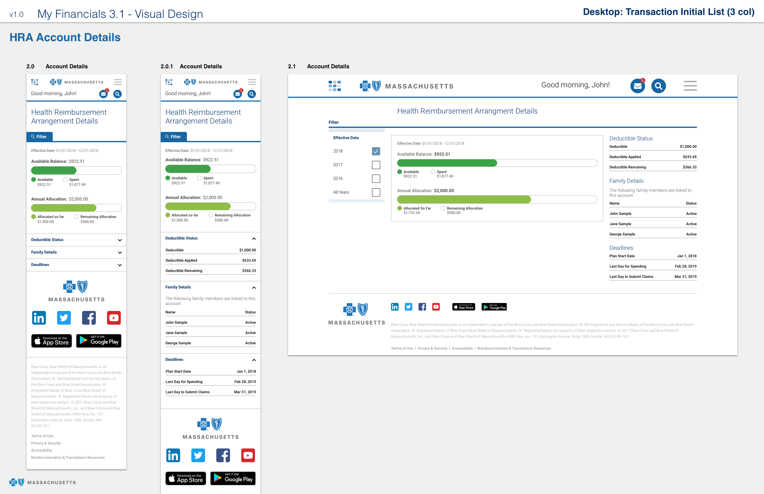
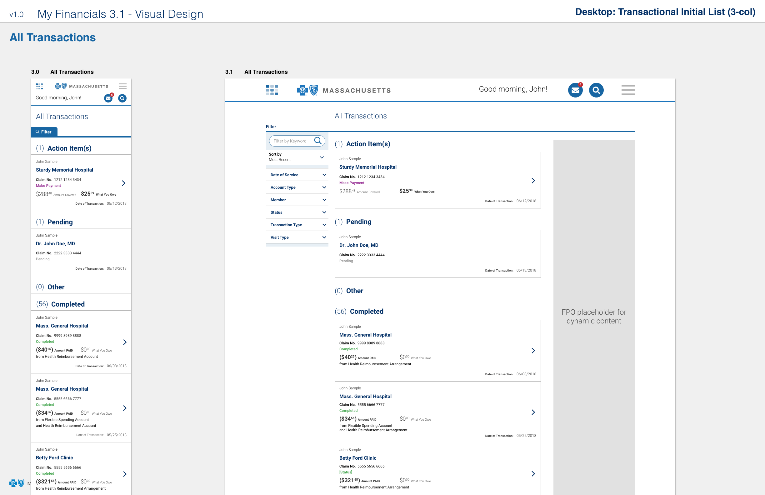
I designed the screens to be responsive, which required organizing and prioritizing content into manageable chunks so it was legible in the mobile space. The biggest challenge was weeding out and reducing the volume of copy that was inherited by the vendor.

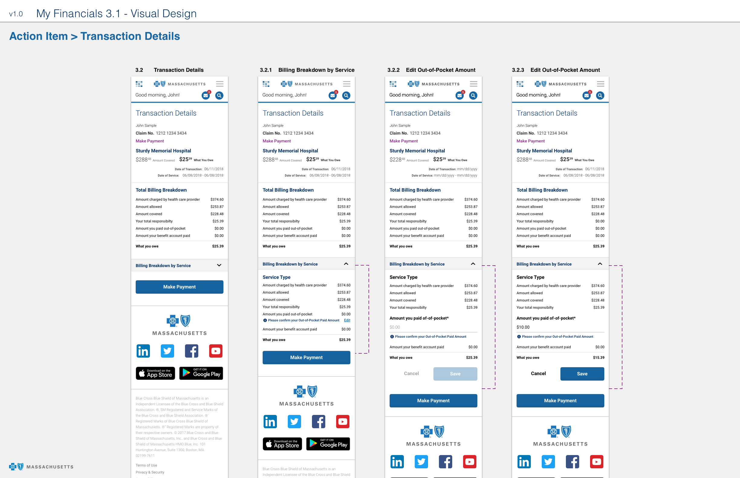

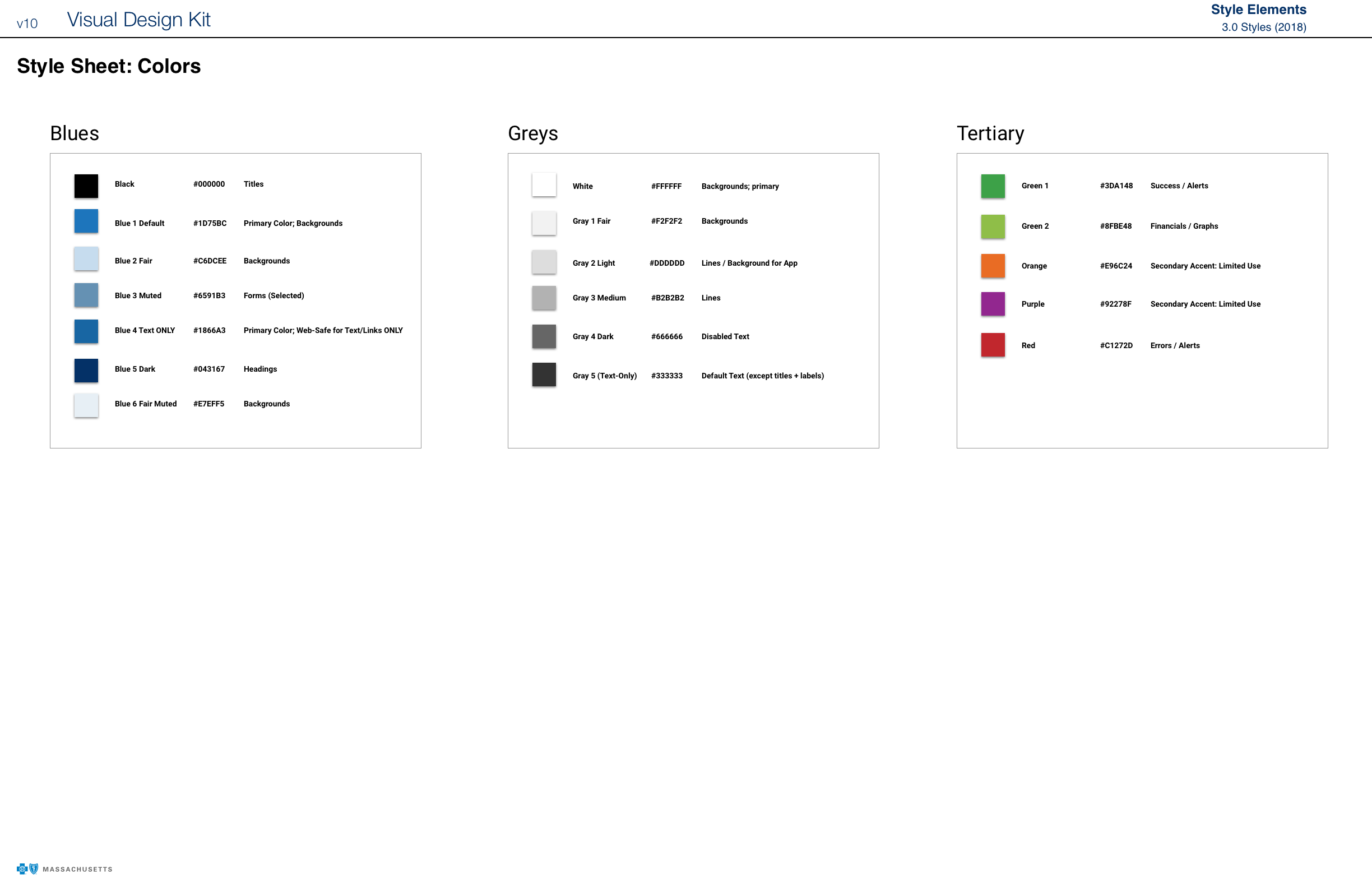
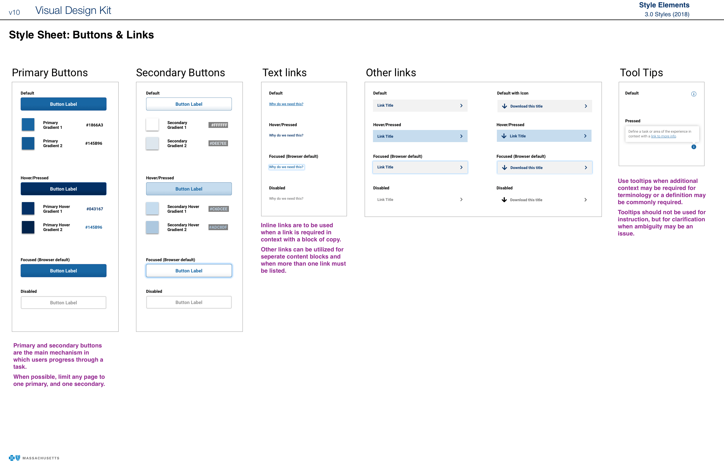
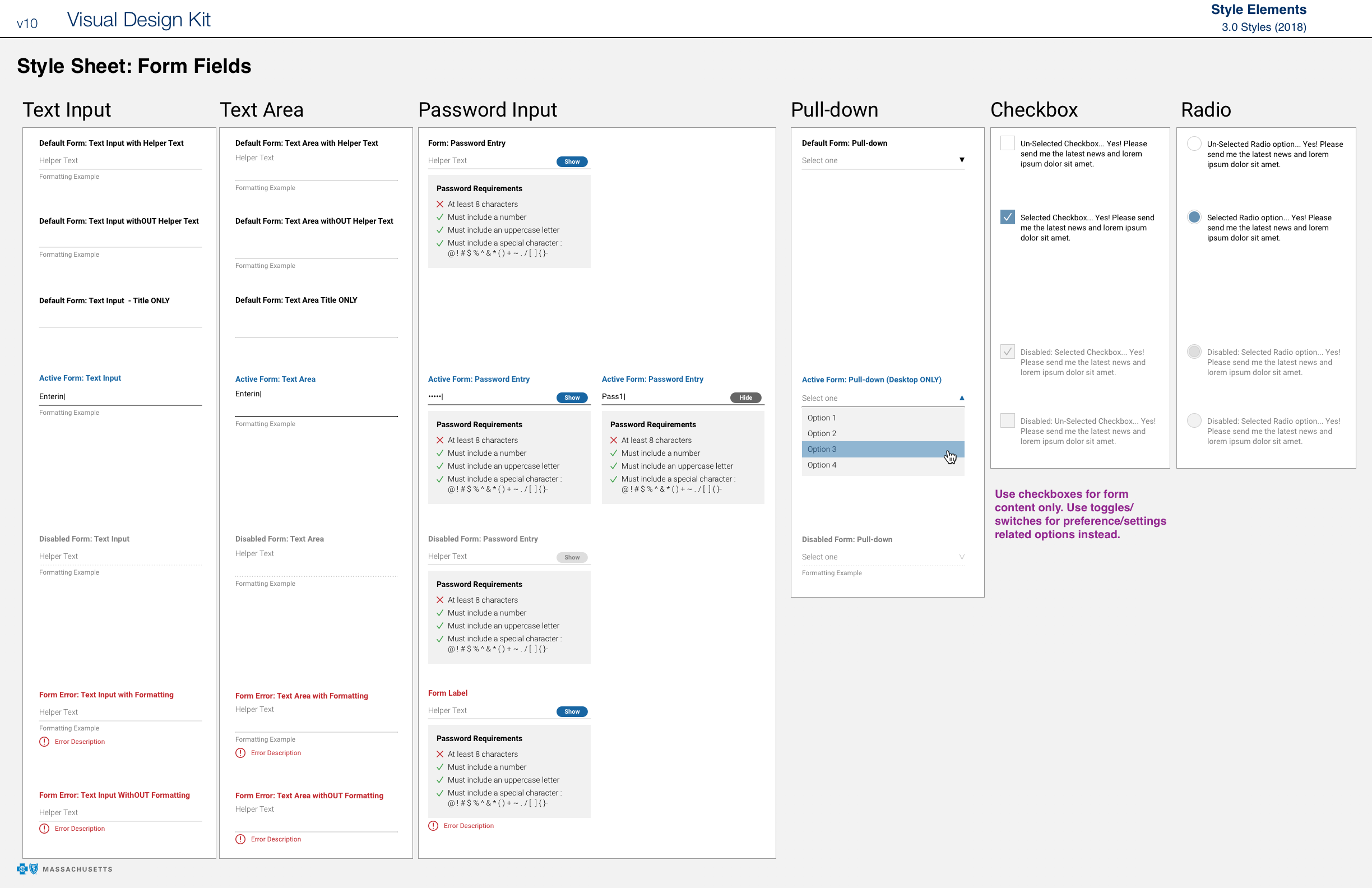
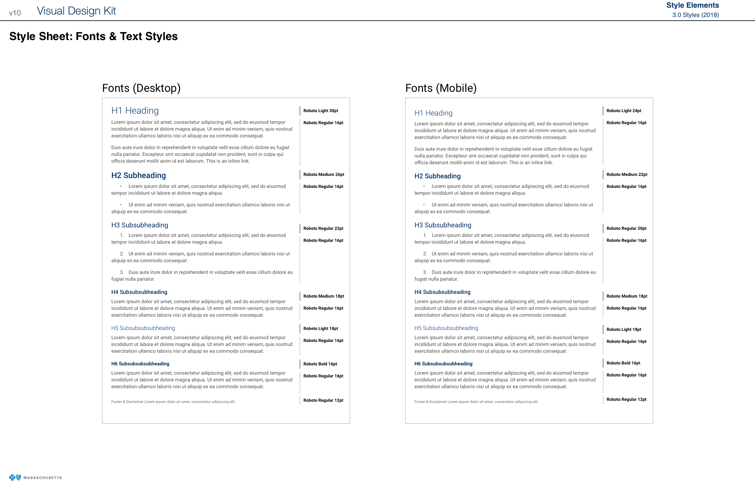
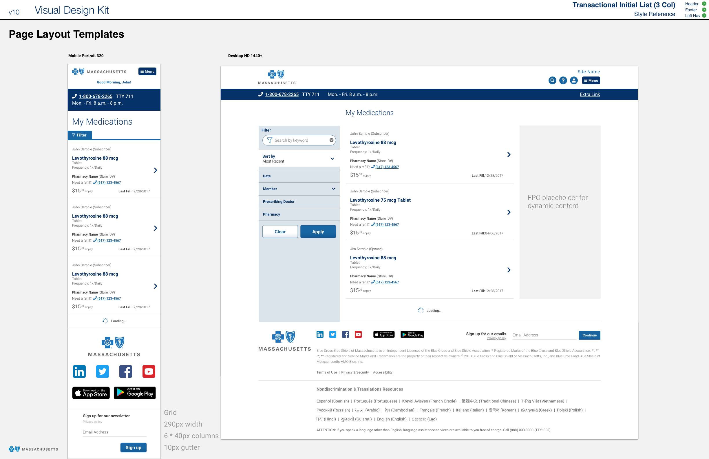
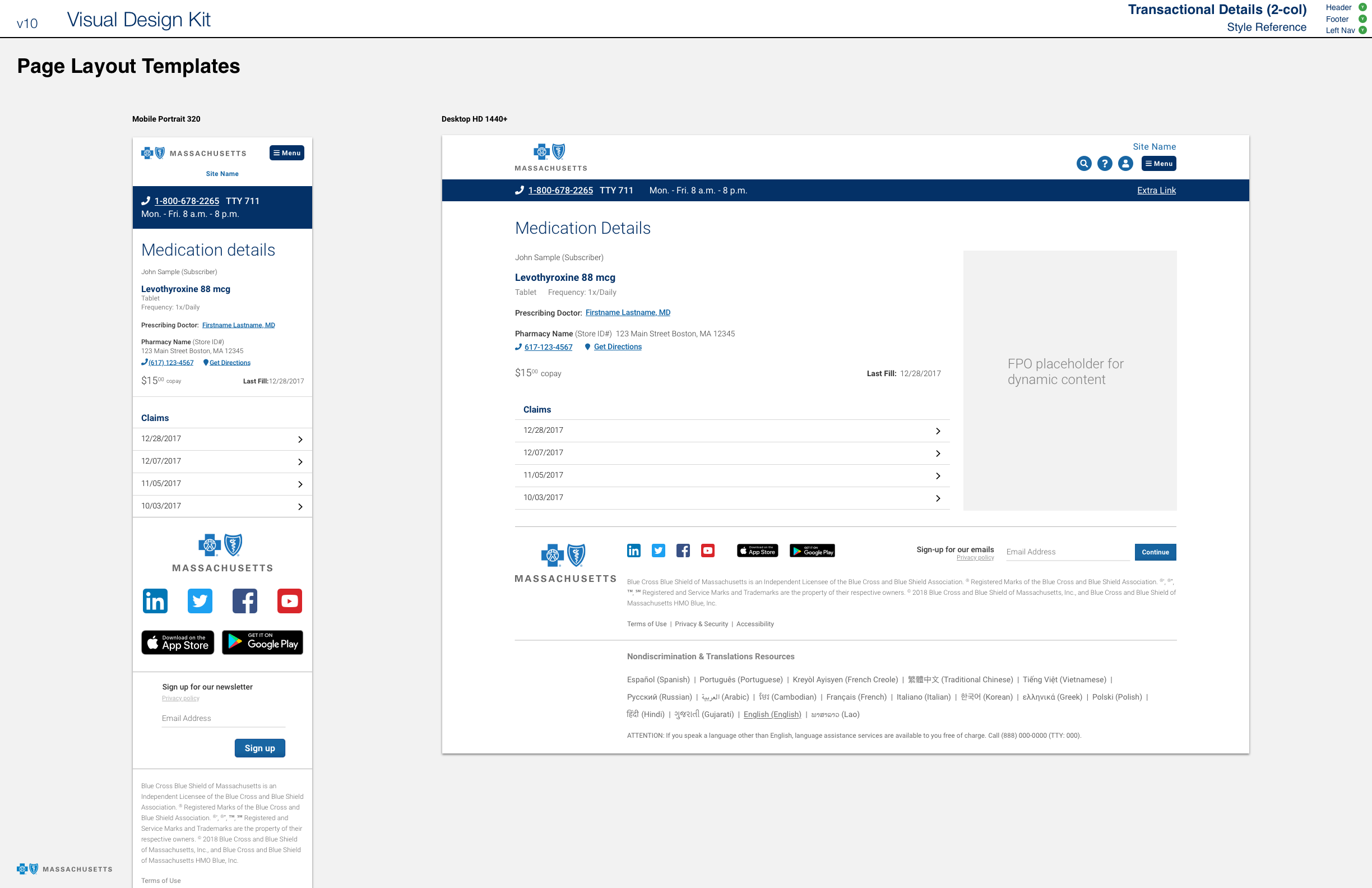
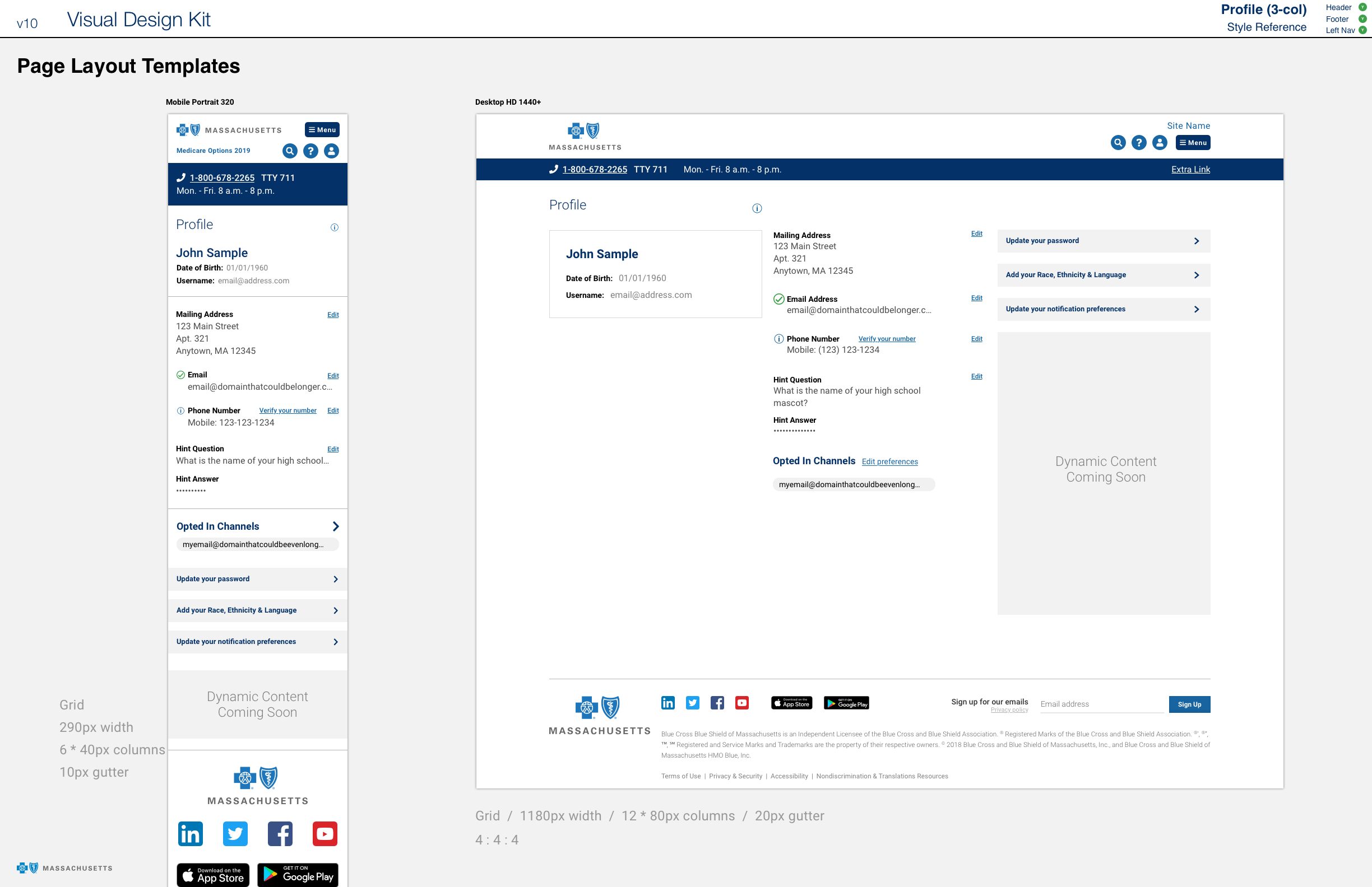
Design System
The screen designs above complied with a new design system that I created in collaboration with my design lead colleagues for the new responsive web platform.

Outcome
The UX solution for My Financials was approved by Product and delivered to Engineering. Most of the features for the new responsive web platform were deployed but I left Blue Cross MA before My Financials went live.
My Role
- Prototyping
- User Testing Support
- Visual Design
- Wireframes
Collaboration Partners
- Business Analysts (2)
- Design Leads + Me (3)
- Designers (3)
- Engineering Leads (2)
- Engineering (4)
- Product Managers (4)
- User Researcher
Tools
- Invision
- Sketch
Duration
- 11 Months (2018)